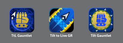
My icon sketches this time around were pretty sloppy, so here are the rough mockups for our top three. The far right design doesn’t really work for an app icon, but as a loading screen it’s looking pretty slick.
16 responses to “Icon’t Decide”
My icon sketches this time around were pretty sloppy, so here are the rough mockups for our top three. The far right design doesn’t really work for an app icon, but as a loading screen it’s looking pretty slick.
I vote for the second icon, it is awesome 🙂
Yea, no clear winner for me this time around but if I had to choose, I’d pick the middle one.
I’d stick with the left one, the one being used in the beta. It has the symbol and the overall tie that makes an icon what it does.
Lol, title
Definitely the middle one, although i do like the idea of a proper gauntlet like in the first icon
Second one
Middle one
I like the left one and its caption. It is the most interesting icon. The middle one looks sort of blah to me, and the right one looks fat.
I’d go with the first one, the second one seems empty.
I’ll go with the left one, it has the arrow which means it’s TLT but it is also guntlet edition.
Though the left one is nice, I think that the middle one is better as far as marketing the game goes. For people not familiar with TtL the one on the left doesn’t do a great job of showing what the game is about. The arrow could be some cursor and what is that fist about?
The middle icon makes it clear it is some kind of corridor navigating game as people are very familiar with this genre, especially on mobile.
I think unfortunately the most aesthetically pleasing icon may not be the best choice. I would stick with an icon that really captures the basic idea of the game as often times icons are like mini ads when people are browsing through 1000s of apps.
@Combat, good idea. That sounds like real marketing right there!
Left one looks best and has best caption. By far.
Middle one looks like a racing game. Right One doesn’t show OMLs graphic design capabilites as well as 1st.
IMHO
I am so freaking psyched to throw $2.99 at you and pray for an Outwitters sequel. Not even being sarcastic here.
*sips from discontinued Scallywags Medic mug*
2
@Anonymous: You know what’s funnier than 2?
*giggles*
…3. Teeheeheehee
Left or middle one