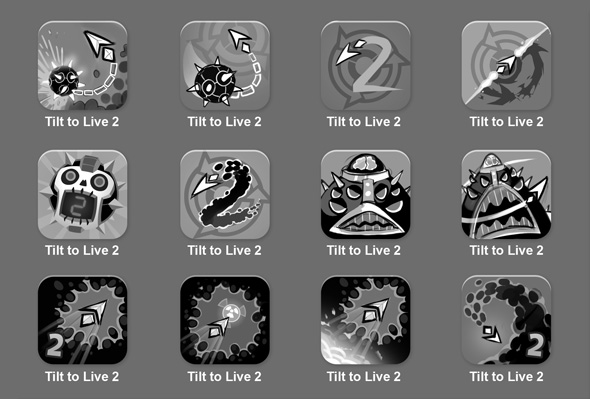
Still searching for a worthy Tilt to Live 2 icon. Do we want it to match the first Tilt to Live? Do we showcase the bosses to catch people’s attention? Or should we just go iconic, like Outwitters? Here’s the latest round of sketches we’re debating.
30 responses to “Box Art Revisited”
I vote for the very last one personally. Wouldn’t really want to show off any bosses. Many of the bottom ones are great, and the ones that spell out a 2 too.
I like 1, 6, and the last one, personally.
would go for the 2nd to the last one, and the last one.
I prefer any of the first three or the last one.
Nice, i really like the 4th, the 10th and the second last! also those bosses look awesome, can’t wait to see them……burnt!!
12 (last one) As is
6 but without the spinner in the background.
iOS 7 simplicity
Last one seems the best. Also make it flat so it plays nice with upcoming ios7 🙂
Second to last! …or 9 but with the 2 tilted left instead of right.
Or 10, but without the powerup. Just the claustrophibic feeling of being surrounded by evil dots! 🙂
Personally I prefer the 6th one.
I love the second one in the first row
The first 2 and the last one are the best!
Last one is the best!
I think the ones that emphasize the cute little iconic arrow are best.
My pick would be the first 2 and the last icon
Bottom right is my favorite. Gives off the feeling of trying to escape. Any in the bottom row are good though.
Columns: 1, 2, 3, 4
Rows: A, B, C
My picks:
A1, A2, A3, A4, B2, C1, C2, C3, C4
Last one!
last one looks really cool
Second to last one hands down!
Love them… either use the top right one, the bomb one (with a 2 on its indicator), or use the bottom left one. Please don’t use the one’s with the giant, weird boss thing (which is sure to look awesome nevertheless within the game)
Keep up the good work, Tilt to Live was arguably the best IOS game I’ve ever played, this is sure to be the next
Just wanted to add, definitely NOT the 1st, 3rd, or 4th in the second row. You want the little arrow guy in your logo so it’s immediately recognizable as a TTL game. Just my two cents.
Your lines should be crisper on your icon, imo. Everything straight, clear, and vibrant. It’s a really small icon, don’t make it too busy.
First or Last!
last row the 3rd one is great too
I like the last one the most 🙂
1 and 11
I loved the 4th in the first row, and the last one (also the 4th) of last row. O think they are amazing! Specially the last one, I would love to have in my dock 🙂
I think the 11th one is EPIC. Trying to get away from all those terrifying dots is a hard job! I vote for it.
I don’t really care for the boss icons or the darker ones at the bottom. I like the brighter simpler icons.
The first one makes sense because it’ll be very similar to the first TTL, showing off your most prominent power up in the game. That’ll give people dem feels of nostalgia, if you know what I mean