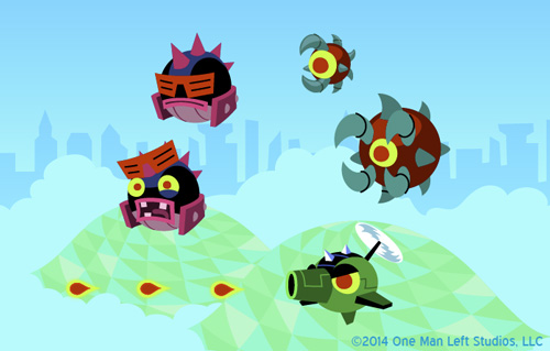
My sketches are becoming increasingly rushed and unpresentable as our deadline creeps up, so here’s some vector mockups for the Arropolis bad guys. Diversifying enemy types and obstacles poses an interesting challenge in a game where all you do is tilt, but I think we’ve done a good job making each new enemy feel like a unique challenge. Hopefully we’ll have time to fit all of these guys into the level!
11 responses to “Arropolis Baddies”

Can’t wait for the final result! Will more maps be created after the release?
No telling what we’ll be doing after release; we’re pretty focused right now on polishing this up.
I know! Outwitters2! (People can dream, right?)
I still prefer new content to the original outwitters but I know I can only dream 😀
Anonymous has a novel idea that would sell like hotcakes. 😀
Well… I think that what I liked best about TtL was its simplicity in design. Outwitters has certainly made you a better artist – which is a good thing to show off. I’m just not sure if the TtL series is really the best thing to design robotic baddies. It may be just me, but an iron heap with spikes doesn’t look like the original “dots vs arrow” thing anymore just because the robot has eyes that resemble dots.
I believe that the metaphor would’ve worked better when a single bot had the idea to get on a tank (much like original TtL’s turret, maybe the power-up was lying around and the dot just tried it).
Or, like in original Gauntlet, the dots cooperated to create sick formations and mazes. I think that the dot thing was the original charm. Brimstone Pinball was yet an okay tradeoff. It was clear that dots were merely hiding behind solid glass.
Now from the things we see appearing Gauntlet’s Revenge there’s not much left of any dots (despite the Dot King’s appearance?). The Skewers (that used to be dot formations in knife/axe shape), the obstacles… everything. It is kind of sad to me that Gauntlet mode turned into a robot-themed maneuvering game. I don’t want to be too negative about it though, change is a good thing and only seeing red would likely have been bland. I’d love to see a Classic Gauntlet mode with the new dot blending visuals opening more possibilities for “living” obstacles and dot formations.
But I would suggest that you better keep all of your (awesome!) robot inventions for other games of different genres.
To explain my point with an example: imagine a dot catapult consisting of dots. They form a catapult to throw a dot at you.
10000 times funnier than a robot spitting dots at you 🙂
@Harti Thanks for putting what was in my head into words
I believe Harti has some point
@Harti: Good note. I did have some concepts for Dot Bots where their “dot essence” was more on display. Unfortunately the technology wasn’t there this game to really bring something like that to life. Having a hundred animated pieces to a single, otherwise simple character can be rough on the framerate.
Ahh, pity.
Shortly after I posted, I figured it might have something to do with the programming side. It’s much easier to define a sprite image with a hitbox than to model the actual formations in code. Framerate is something I hadn’t even thought of, thanks for the info. 🙂
Bottom line is still that your skills are top-notch! The various environments look interesting and are very detailed for the short time frame you got.