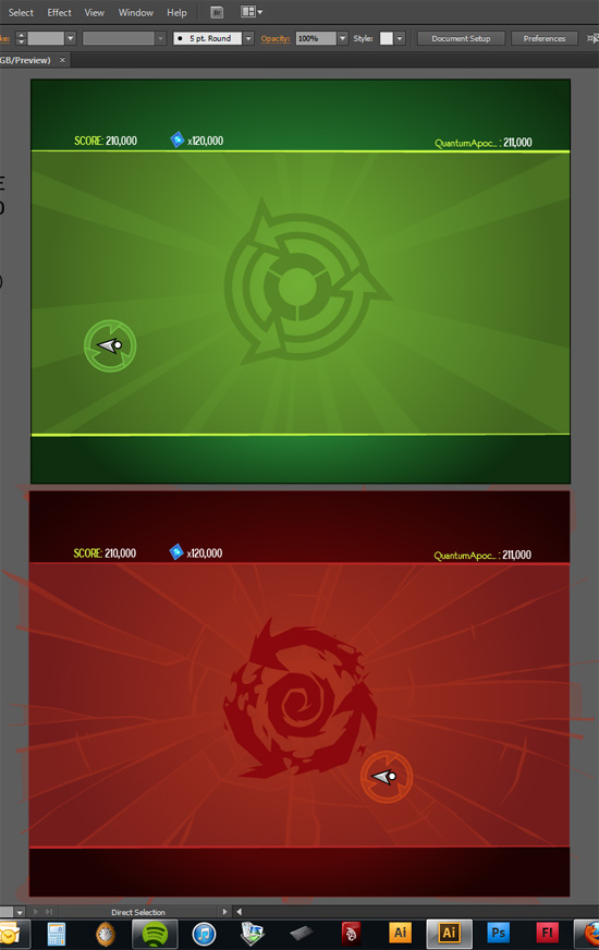
These barren screens are early background concepts for a likely iPad version. The arena would be scaled between devices, so you can compete with your friends even if you don’t have the same iThing. Can you tell I was playing DmC when I came up with this Code Red concept? Code Red in Tilt to Live is hard mode, so I really like the idea of making it sort of a Limbo/Silent Hill Otherworld version of Classic Mode.
8 responses to “Early Backgrounds”


LOL the high score belong to QA. Also the new Cod Red logo/beckground looks great, I like the idea of Classic mode in “hell of dots” (sound like a name of acjivment).
Son of a gun, Adam! Actually looking forward to this 50% more now. 😀
I use Quantum a lot, because his Game Center handle is so long, it never fits any of my damn menus.
I didn’t like the green background.. I don’t know.. looks too “right”, too perfect.. the red one is better, cooler!
The red one is amazing! Go ahead!! Can’t wait to play this game!!!
Hahaha Code Red looks almost terrifying ha. Please tell me the app icon won’t have a giant, ridiculous 2 on it…
You’re welcome 😛
Backgrounds looking nice 🙂
Looks great!
@Avenged110 Make that a “redonkulous” 2.