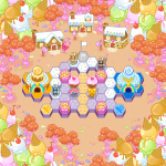
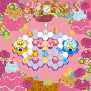
I present the current incarnation of the Adorables’ Map Theme. Their metropolis is made of candy, and their cliffs of Cinnamon Toast Crunch. Like it was with the Feedback, that game board in the center is not an actual map.
The Adorables is a pretty goofy team, but you’d be surprised how much effort and research went into crafting the look. I seriously took time to google pastries, watch My Little Pony, and listen to Danny Elfman, all to engage the little girl that dwells inside me. Because apparently one does.
This is actually my second pass on the Adorables’ map design, which used to look like this:

13 responses to “The Happiest Place on Earth”


sorry, but I don’t think I like either. I guess that’s just the male side of me but I find the backqround too busy. On TTL the background was so much cleaner and slicker. I’m going to miss that.
How is the coding coming along?
I can’t even see the pictures 🙁
Too focused on candy. Try mixing it up more.
@Shoe The coding is coming along fine. Later on, as things start coming together we’ll hopefully be able to show off more of the features of the game.
@Avenged110 what browser/device are you using?
@Someone I like candy.
@Alex Safari 5.1 on an iMac. Things usually work just fine btw
nevermind, worked on iPhone!
Seems like a lot of work to have actually watched that stuff. Keep up the good work guys!
Cool
will each team have a specific base for every time they are on the feild? because i the second picture the robots’ base is made out of candy… i dont think it suits them
I kind of agree with Shoe. I quite liked the feedback one because the dull, industrial colours toned it down, but the brightness of the Adorables’ world means that even the same amount of detail as the Feedback world makes it look a bit crowded.The design of it isn’t bad at all – I actualy really like how you’ve done it – but I do wonder if it will be distracting in gameplay.
@lolcopte I wouldn’t take the second pic too seriously. It has three different colours of Feedback soldier, a Scrambler, and an Adorable. Probably just an early mock-up to demonstrate how it would look in play.
I Like the design 🙂 all the details make the map look very playful and I think that suits the adorables very well.
There should be a kind of ‘aura’ around the various characters based on the race. Because the Feedback won’t look so threatening when surrounded by bright colours.