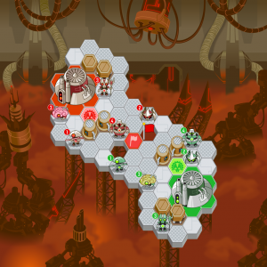
Anybody that’s ever done creative work will tell you, revisions can be painful. Especially when you’ve got a LOT of other work to get to, and the thing in question is “good enough”. But let’s face it, the old design was overly repetitive, and I just wasn’t crazy about it thematically. I’m fairly new to level design, so the work was bound to need redoing.
Here’s my second pass, one that I think is getting much more attractive. If the Adorables level is going to be the cutest thing I can think of, the Feedback should hit the other extreme.
19 responses to “Revisions: Inebbidable”


As for the map itself, i see that there’s no change, but the background looks much better than before. Good work!
Now that is good.
(Yay for really basic HTML!)
Better. I think robotland would have more grey structures over brown. This works too.
I love it! Far better than the first one (and even that was very nice)
This is really pretty, and I know you guys are working hard, but I still think you need to integrate the background and tiles. It still just looks like some tiles on top of an image. They need to be in the same color scheme, and they need to be directly integrated. I know this sounds critical, but I’m just trying to be helpful. 😛
Totally agree with Russell. That would definitly help the graphics a lot. This design is much much better, I can’t say I really liked the original.
Are the race-based levels all going to be small, or is there going to be a small, medium and large stage for each race, or what?
i think that the white tile’s look a bit too clean in comparison to the background. i also think the tiles should suit the race. eg. grass covered tiles for the plant armies home base
Yes, a themed game board would push it from good to awesome.
@Solan @Super Volcano: You guys can safely ignore the map’s layout, that’s just a placeholder I use to work on the background. You can’t see as much background on the larger levels, so I start small.
I also think that the Feedback medic should be redone. The hard hat looks out of place.
Good point.
And is it just me, or does the Adorables’ runner look distinctly… unadorable?
Look at us, once Adam mentions revisions, off we go…
yeah i agree that its bright yellow hard hat is a bit out of place… perhaps making it grey or blue would make it more robot like
Personly,(however you spell that)I think that the Feedback’s medic should be changed to NO hard hat. You could make it have more of a blocky head, kind of like a medic droid from Star Wars. I also think it should have a bunch of lights on it’s head. Some big, some small. Just an idea.
what program do you use to make the art on???
I love the scrambler. It’s just so awesome.
Well I think we might need some small revisions on various team members as people above have commented, but I suppose I should have actually looked at the full size picture before commenting. ANYWAY. I personally think that with a little more intergration between the fore and backgrounds and a little more rustyness to the level itself and it would be perfect. There needs to be considerable difference between the layers so people can clearly see without having to look closely where the course is.
I could do a much longer ramble, but I’ll save that for an e-mail.
I’d like the thank everyone for the FEEDBACK! LAWL.
I took a really close look at the picture and noticed the actual part where you play is weird in 3D space. Looks tilted upwards.