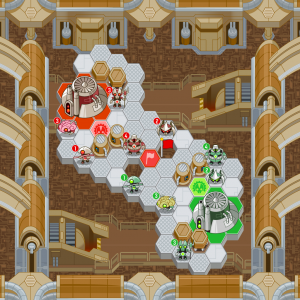
So for each race in Outwitters, I’m designing a “home turf” map theme to compliment the character designs. What you see here is a wide view of the Feedback’s homeworld, as it stands now. This is also kind of our first screenshot! Neat.
The colorful spaces with the team logos are spawn points, which are the spaces you tap to create new units. The space with the flag on it is a capture space, which I can explain for you guys another day. Suffice it to say, those help you gain the upper hand. And the number floating beside each unit displays its health.
The Feedback’s world uses a lot of dull grays and browns to give it a doom-and-gloom, industrial vibe. They are our robot overlords, after all. The other maps I’m working on will be more vibrant, colorful places like a beach scene and a forest village. Still not really sure if this is the design we’ll stick with. There are some other ideas in my sketchbook I’d like to try out, if we have time.
That’s all for this week. It’s starting to look like a real game now! Check back soon for more Outwitters team reveals and artwork.
18 responses to “Home, Sweet Robot Home”


I don’t see a single bird on this screen. I thought Apple required birds in all games now. Moar birds!
A bird team would be awesome!
[…] This post was Twitted by wblackall […]
The game looks great so far and i’m looking forward to it. Is there going to be a offline mode? and will it be available on the mac app store aswell?
Looks kinda like uniwar
The game looks great so far, especially the units. I think there should be a more integrated setting, though. Right now it looks like some gray hexagons, with a sight metallic look, on top of mechanical background. I think it would be better if the background and hexes shared the same color scheme and were graphically seamless. I’m not trying to be critica, just helfull, though! You guys are amazing!
there will be a special race for those who have tilt to live right? an army of dots with the cursor being the special.
I’m sorry to say that I expected better. I thought in the playing field you would have more free space to move around, rather then two dozen hexagons which are only capable of holding one soldier. Being my favourite app, Tilt to Live is undeniably original. Whereas Outwitters is set on a tessellating hexagon map which I’ve seen used before. I expected a rectangular map where you advance your soldier from their bases, say, in the corners. From there, you could manipulate the map so you can pinch to zoom in and stretch to move out. This would allow bigger space for movement and possibly over two race battles.
Other then that, Outwitters will probable turn out better then I probably thought, but anyway, keep up the good work. Sweet app in the making.
Aw yeah, screen shot! Imhungry4eva has a point that this is used frequently, but I still love how it is. Keep up the great work!
@comment #8
Woah, hold it! We barely even know how it will work! There’s plenty of time for stuff to change. I don’t mind the hexagonal design at all – I think it could get messy otherwise. Also, there’s a possibility that this is just the design if the Feedback stage. I admit, larger stages might be better, but that could easily happen. I imagine there could even be multiple stages available for each team. Bu don’t criticise a game that’s still an early prototype, which you know so little about.
@OML, are any of those suggestions likely to happen? Like the multiple stages idea? Maybe even a stage designer? That would be great.
This is a “small” sized map design, for faster-paced games. We have bigger 1-on-1 maps in the works, too. How big we go will depend on whether we can support 4 players simultaneously, but we haven’t gotten that far just yet.
A mapmaker would be awesome as well!
Are you going to make cool animations of when different characters do different things (such as moving and attacking) ?
In each turn, what things will you have a chance to do (will you either move a guy or spawn a guy or both)?
Nice
Ok, since Adam said that this may be only a ‘small’ map it makes me feel better. Especially considering it is only an early and small prototype, I think it has a big future.
I personally couldn’t care less if the stage uses a hexagonal pattern or not. The design is simple but amusing. I think what really matters is the gameplay, and right now, it looks like it’s turning out to be a pretty good game. Also, I agree with Graham. While this game does center on online multiplayer, I think there should be an offline mode/ single player campaign for when we are on the go and cannot use the online feature. It’s just a suggestion though. Overall, it looks like a great game in the making. I am a huge fan of Tilt To Live, and I fully believe that you guys can create another great game.
Love the art style! Looking forward to seeing some of the other unit designs!
Is Outwitters going to have gameplay similar to the ps3 game: Mushroom Wars?
Or the iphone game: Supermacy Wars?
Because seeing the screenshots and hearing about different teams to battle seems like it.
If it is, that would be awesome becasue those are one of the coolest strategy war games!